Sunday, February 23, 2014

Here is my updated design with an orange bar at the bottom instead of blue.


Friday, February 21, 2014

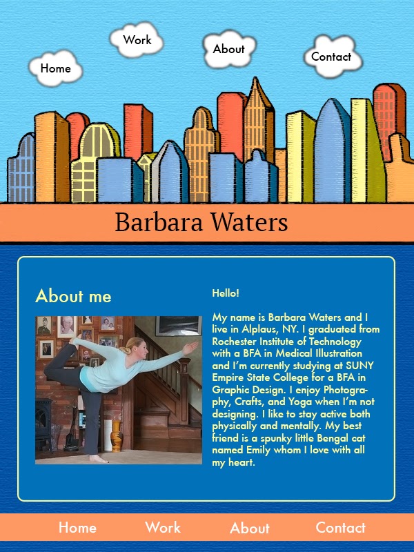
Here is my final design. I traced my sketch in Illustrator then colored it in Photoshop using the quick select tool to fill with color and the paint brush. I applied a pastel drawing filter to the city and bridge and a texture filter to the background. I also used gaussian blur on the navigation clouds to make them look more cloud like. During this project I focused on keeping my layers organized. During previous projects they were a little out of control. It's much easier to work when they're organized.

Home page:

 Work page:

 About page:

 Contact page:

Sunday, February 16, 2014

For this project I am making a design for a portfolio website. I will make an illustration of the cityscape that I sketched for the background. I’m going to use blue as the main color and orange and yellow for the details. The clouds will be the navigation buttons. I think this will be an effective design because it conveys my fun and whimsical style.


Sunday, January 26, 2014

e card

The topic of my e card design for environmental sustainability is the promotion of growing vegetable gardens instead of lawns. Growing grass can do a lot of damage to the environment.  Many people use a lot of water and chemicals to maintain their lawn. Gas powered mowers emit a lot of pollution. Vegetable gardens are a much more environmentally friendly option. The first section of my e card is an introduction to the topic, then middle section gives the details, and the last section sums it up. I think this design will be effective because it gives information in a positive way.


Tuesday, January 21, 2014

Here is an updated version of my design. I made changes to the author name and text on the back cover.


Thursday, January 16, 2014

I removed the blue bands from my original design to make the design less busy. For the photo on the front cover I used the clone stamp tool and paint brush to remove the “Lark Tavern” part of the photo and replaced it with “Son Volt”. I distressed the type and free transformed it to make it blend in with the photo. I used HDR toning and desaturation to make the photo look more interesting. I also added a camera flare to look like the sun coming over the top of the building. For the back cover, I used gaussian blur and soft light to make the photo glow a bit, then added a mask to bring some of the detail back into the tree line. I also made a logo for the fictional publisher in Illustrator. I altered the photographs and distressed the type in Photoshop, then put all the elements together in InDesign.